Build PowerPoint slides
Contents
Build PowerPoint slides#
Beta version
The Tally Python SDK has a flexible feature set to build PowerPoint slideshows and gives the user full, granular control over the content of the slides. The slides contain natvie Office/Excel charts, so they can be edited like any other chart created in Excel.
The build object#
We start by loading our dataset, creating a build object and add a presentation to it.
ds = tally.DataSet(api_key=my_token)
ds.use_spss(`tests/fixtures/Example Data (A).sav`)

build = tally.Build(name=`client A`, default_dataset=ds)

presentation = build.add_presentation(`My client`)
Then we decide what variables we want to add as charts and what we want to visualise in the charts, i.e. whether we want to show percentages, means, counts, etc.
presentation.add_slide(
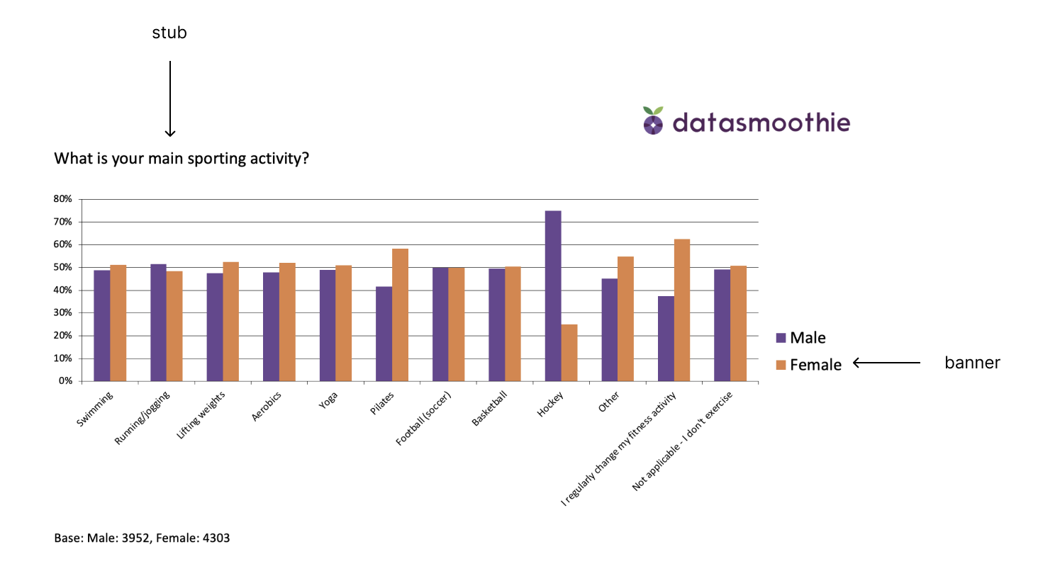
stub="q1",
banner="gender",
show=`r%`,
options={
`chart_type`:`column_clustered`,
`template`:1,
`title`:`What is your main sporting activity?`
}
)
Finally we save the file
presentation.save_powerpoint(`test.pptx`)
Options for add_slide#
We decide what our PowerPoint file is going to look like by supplying options to add_slide.
Selecting data with stub and banner#
Two options indicate what data to use: stub and banner. Below, the stub is “what is your main sport” and the banner is “gender”.
Selecting what to calculate with show#
Using the show option, we can select what we want to calculate. The optoins are
counts- the counts/frequenciesc%- column-wise percentager%- row-wise percentagemean- the mean descriptive statistic
Setting PowerPoint specific features with options#
Finally, use the options parameter to set options specific to the PowerPoint file. The available options are
chart_type- what chart type to usetable- show a table in the slide with the data selected (same options available as in theshowparameter)slide- what master slide to use for this slide (defaults to 1)tick_labels_font_size, default 11title, default Nonetemplate, default 1,show_question_in_chart, default False,value_axis_maximum_scale, defaults to Excel’s automatic scalevalue_axis_minimum_scale, defaults to Excel’s automatic scaledata_labels, default False,data_labels_font_size, default 9data_labels_font_color, RGB value default [0,0,0]data_labels_number_format, default Nonedata_labels_position, default inside_end
Supported charts#
Supported chart types are:
three_d_area, three_d_area_stacked, three_d_area_stacked_100, three_d_bar_clustered, three_d_bar_stacked, three_d_bar_stacked_100, three_d_column, three_d_column_clustered, three_d_column_stacked, three_d_column_stacked_100, three_d_line, three_d_pie, three_d_pie_exploded, area, area_stacked, area_stacked_100, bar_clustered, bar_of_pie, bar_stacked, bar_stacked_100, bubble, bubble_three_d_effect, column_clustered, column_stacked, column_stacked_100, cone_bar_clustered, cone_bar_stacked, cone_bar_stacked_100, cone_col, cone_col_clustered, cone_col_stacked, cone_col_stacked_100, cylinder_bar_clustered, cylinder_bar_stacked, cylinder_bar_stacked_100, cylinder_col, cylinder_col_clustered, cylinder_col_stacked, cylinder_col_stacked_100, doughnut, doughnut_exploded, line, line_markers, line_markers_stacked, line_markers_stacked_100, line_stacked, line_stacked_100, pie, pie_exploded, pie_of_pie, pyramid_bar_clustered, pyramid_bar_stacked, pyramid_bar_stacked_100, pyramid_col, pyramid_col_clustered, pyramid_col_stacked, pyramid_col_stacked_100, radar, radar_filled, radar_markers, stock_hlc, stock_ohlc, stock_vhlc, stock_vohlc, surface, surface_top_view, surface_top_view_wireframe, surface_wireframe, xy_scatter, xy_scatter_lines, xy_scatter_lines_no_markers, xy_scatter_smooth, xy_scatter_smooth_no_markers